My Images
Over Christmas I was researching my project and decided that getting out there and actually taking some pictures would be the best way to see what works well. I concentrated on two different areas: the straight on views and a more abstract view as well. This was what was most easily done from home, it is a lot quieter around where I live than in Coventry so the bus stops I was visiting to take pictures of were generally empty and there was no one there. I think that this could be used as a comparison to the more busier bus stops of Coventry and other areas such as Birmingham and Leamington Spa.
I think that the straight on images work better than I initially thought that they would. As all the bus stops at home vary the images as a block are actually quite interesting. It works really well as a comparison. If I was to do this with just bus stops from Coventry I don’t think this would have the same effect as they are all very similar, the only thing that I could compare in this sense would be the surroundings of the bus stop. Although this wasn’t something that I was initially interested in this could be something to looking into further. Why is a bus stop where it is? Is there a reason for it? Why are bus stops often very close to a series of other bus stops? Is this just bad planning or for another reason?
Within this project I really want to explore as many avenues as I can. I realise that all of these may not fit together and work well as a series. However I think that the more work I produce the more options I have and hopefully the better the project I can create. At this point I don’t know what is going to look good until I have tried it, so by not trying something really would effect my project.
Below are the images that I created straight on and in a uniform style. I think that these images are alright but what really makes them stronger is when they are put together as a series. On their own I don’t think they tell much of a story, you may look at it but not really take much in.


Here are the edits that I made that I think work a lot better.
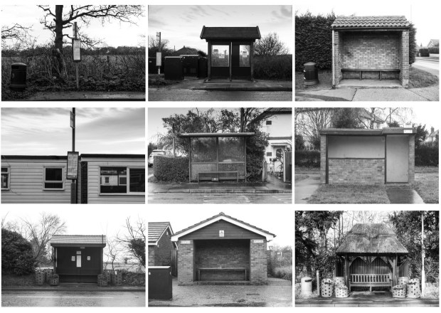
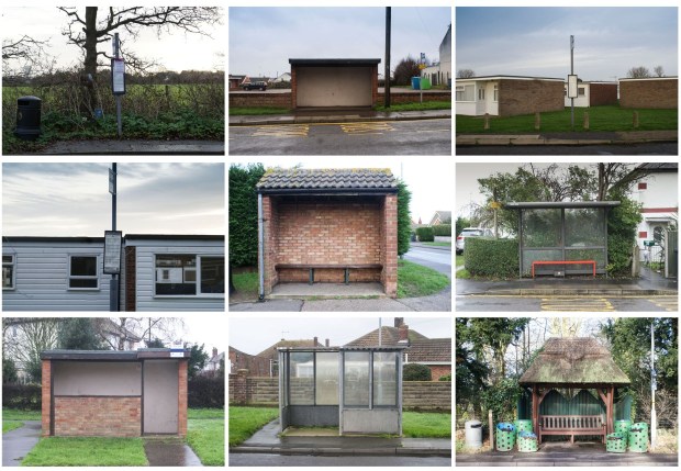
I’m not sure whether I prefer the black and white images or colour ones. They definitely both have their pros and cons. If I end up looking more at the surroundings then I definitely think the images need to be in colour, when they are black and what I think this takes a step back. Although the bus stop itself is always the forefront of the image and what you notice I think it is more likely that you will be distracted by something in the background if it is in colour. At the moment I am probably swaying towards colour as a whole, however I do need to consider what the bus stops at other locations are like and what will work best there as well.
The other aspect I experimented with was a more abstract view. The idea behind this was to make the bus stops seem like their own work of art. I am taking pictures of parts of the bus stops which generally might not be noticed and by looking at my pictures they might not even be able to tell that they are at a bus stop. I am hoping that when they realise that it is that they will notice this in day to day life as well and just generally pay more attention to their surroundings. I am happy with these pictures however I don’t think that they stand alone. I need to keep experimenting with different ideas to find something to pair them with.


